CSS :has() & Responsive Design

The CSS :has() pseudo-class was shipped for Safari in March 2022 and for Chromium browsers the same August. It's described on the Webkit blog as a way to "apply CSS to an element based on what’s happening inside that element" - so if I was to try and assign it some kind of pseudocode equivalent, an if contains.

The demands of responsive design by nature require flexibility, so the conditional qualities that :has() offers is a great addition to the CSS toolset and widens our options in aiming to achieve this kind of flexibility.

Towards the end of 2022 I was working on applying responsive design principles to the primary apps of a client suite of web apps.

In the interfaces, we have quite a few places where we have a heading aligned with some action buttons (shown here as the 'My latest devices' heading):
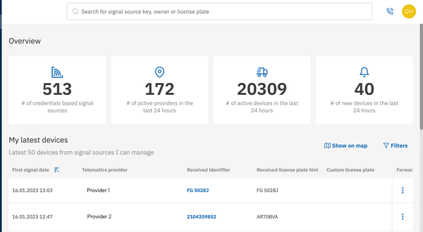
CURRENT DESKTOP HEADER LAYOUT

The heading and buttons collectively make up our React component Header, which accepts both as props.

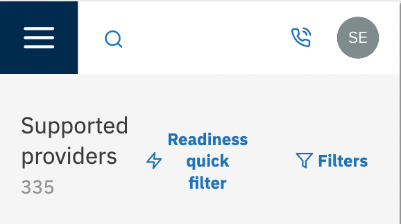
On mobile devices, this can end up looking pretty congested - text bunched up together, and tall buttons where the icon looks a little out of place.

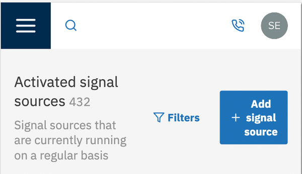
PREVIOUS MOBILE HEADER LAYOUT - CROWDED

Here’s what I tried at first in an effort to solve the problem:

Different button

I thought at first that we could make the buttons into a single ‘actions menu’ sort of button, before realizing that on some pages, there was a similar button just above. Having two lots of "actions" could be confusing, and even though on mobile, one would have to scroll down to see the second button and then the first one would be out of view; it wouldn't completely dispel the risk of things getting mixed up, and probably isn't best practice.

TWO ‘ACTIONS’ BUTTONS WASN’T GOING TO BE AS USABLE
 

Keeping these buttons, but just applying flex-direction: column so they would sit nicely underneath the heading

I then considered simply changing the main container for Header to use flex-direction: column for smaller screens, so the elements could all have some breathing room, like this:

COLUMN LAYOUT GAVE MULTIPLE BUTTONS SOME SPACE

That also changed the headers that just had one button, like the one adjacent to the Actions button shown above. Perhaps this is not so bad, but it was not desired. An 'actions' menu aligned next to the heading seemed most suitable, even on a small screen.
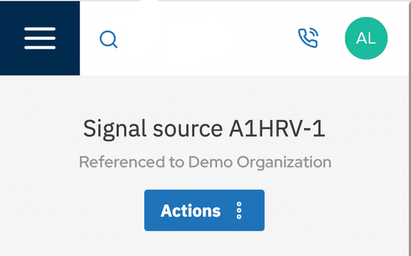
NOT AS DESIRED JUST FOR A SINGLE BUTTON
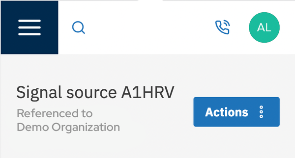
DESIRED

I also tried to implement a JavaScript solution where I added a class based on the conditions I was looking for, but the way that the header component and its props had been implemented meant it was difficult to avoid unnecessary complexity.

CSS :has() saves the day

After deciding CSS was probably the only way, I thought again about what I needed: a style that exists only where there are more than two buttons in the header. A style when a header only has two buttons.

There had been a lot of hype around CSS's :has() in my weekly dev newsletters, but even so, I wasn't sure in detail what it did - I wasn't sure it could solve this problem. After some Googling and going back to those articles, I learned that it was a "way to apply CSS to an element based on what’s happening inside that element."

At first-glance though, :has() didn't seem very complex, or powerful. I had questions I wanted :has() to answer: "Does my div have more than one button?", namely. Even though it's called :has() rather than :have, I was determined that it could answer this question for me, despite not seeing the examples that I needed immediately.

An explanatory video

Understanding CSS:has(), the top result when searching for "css has" on YouTube, really breaks down just what you can do with this seemingly humble pseudo-classs.

Towards the close of the video it presented some pretty unreadable code, but the use of the already familiar nth-child caught my eye.

The video presented a way to colour the background of alternative rows in a table:

tbody:has()(> tr:nth-child(7)) > tr:nth-child(odd) {
  background: silver;
}

Admittedly, it took me a moment to understand this code. What is happening here?

The tbody:has()(> tr:nth-child(7)) looks for the element which has a direct descendant (> being the child combinator) which fits the description tr:nth-child(7). In other words, it's looking for a table which has more than 6 rows. There's another child combinator after that to select any row which is an odd-number child, of that same table.

So essentially, highlight in silver any odd-numbered row that's a child of any table, as long as that table has more than 6 rows. This shows how powerful :has() really is, and how it can be combined with other features of the language to achieve this power.

How I applied that to my responsive design

As explained above, the criteria I wanted to apply when it came to ordering my header buttons underneath the heading text was "the header has (within it) more than one button". I could create that criteria with this code:

  .header:has()(button:nth-child(2)) {
    flex-direction: column;
    text-align: center;
  
    h2 {
      padding-bottom: $spacing-sm;
    }
  }

And create the design I desired once again.

FINAL MOBILE HEADER LAYOUT

Concluding thoughts

On the WebKit blog, Jen Simmons writes, “It’s been a long-standing dream of front-end developers to have a way to apply CSS to an element based on what’s happening inside that element.” Using has() in the scenario above, avoiding either a more convoluted solution or a restricted design has allowed me to explore why this is such a helpful development. I imagine it will provide simpler solutions for responsive design problems and a variety of other styling obstacles for time to come.

Blog 11/15/22

5 lessons from running a (remote) design systems book club

Last year I gifted a design systems book I had been reading to a friend and she suggested starting a mini book club so that she’d have some accountability to finish reading the book. I took her up on the offer and so in late spring, our design systems book club was born. But how can you make the meetings fun and engaging even though you're physically separated? Here are a couple of things I learned from running my very first remote book club with my friend!

Blog 7/14/21

Building and Publishing Design Systems | Part 2

Learn how to build and publish design systems effectively. Discover best practices for creating reusable components and enhancing UI consistency.

Blog 7/13/21

Composite UI with Design System and Micro Frontends

Discover how to create scalable composite UIs using design systems and micro-frontends. Enhance consistency and agility in your development process.

Blog 7/15/21

Building a micro frontend consuming a design system | Part 3

In this blopgpost, you will learn how to create a react application that consumes a design system.

Blog 8/10/22

So, I wrote a book

Join me as I share the story of writing a book on F#. Discover the challenges, insights, and triumphs along the way.

Blog 5/1/21

Ways of Creating Single Case Discriminated Unions in F#

There are quite a few ways of creating single case discriminated unions in F# and this makes them popular for wrapping primitives. In this post, I will go through a number of the approaches that I have seen.

Blog 11/30/22

Introduction to Partial Function Application in F#

Partial Function Application is one of the core functional programming concepts that everyone should understand as it is widely used in most F# codebases.In this post I will introduce you to the grace and power of partial application. We will start with tupled arguments that most devs will recognise and then move onto curried arguments that allow us to use partial application.

Blog 9/14/22

Learn & Share video Obsidian

Knowledge is very powerful. So, finding the right tool to help you gather, structure and access information anywhere and anytime, is rather a necessity than an option. You want to accomplish your tasks better? You want a reliable tool which is easy to use, extendable and adaptable to your personal needs? Today I would like to introduce you to the knowledge management system of my choice: Obsidian.

Blog 7/25/23

Revolutionizing the Logistics Industry

As the logistics industry becomes increasingly complex, businesses need innovative solutions to manage the challenges of supply chain management, trucking, and delivery. With competitors investing in cutting-edge research and development, it is vital for companies to stay ahead of the curve and embrace the latest technologies to remain competitive. That is why we introduce the TIMETOACT Logistics Simulator Framework, a revolutionary tool for creating a digital twin of your logistics operation.

Blog 4/16/24

The Intersection of AI and Voice Manipulation

The advent of Artificial Intelligence (AI) in text-to-speech (TTS) technologies has revolutionized the way we interact with written content. Natural Readers, standing at the forefront of this innovation, offers a comprehensive suite of features designed to cater to a broad spectrum of needs, from personal leisure to educational support and commercial use. As we delve into the capabilities of Natural Readers, it's crucial to explore both the advantages it brings to the table and the ethical considerations surrounding voice manipulation in TTS technologies.

Blog 3/17/22

Using NLP libraries for post-processing

Learn how to analyse sticky notes in miro from event stormings and how this analysis can be carried out with the help of the spaCy library.

Blog 11/3/22

Inbox helps to clear the mind

I hate distractions. They can easily ruin my day when I'm in the middle of working on a cool project. They do that by overloading my mind, buzzing around inside me, and just making me tired. Even though we can think about several things at once, we can only do one thing at a time.

Blog 5/25/21

From the idea to the product: The genesis of Skwill

We strongly believe in the benefits of continuous learning at work; this has led us to developing products that we also enjoy using ourselves. Meet Skwill.

Blog 7/16/21

Building A Shell Application for Micro Frontends | Part 4

We already have a design system, several micro frontends consuming this design system, and now we need a shell application that imports micro frontends and displays them.

Blog 11/14/23

Part 2: Data Analysis with powerful Python

Analyzing and visualizing data from a SQLite database in Python can be a powerful way to gain insights and present your findings. In Part 2 of this blog series, we will walk you through the steps to retrieve data from a SQLite database file named gold.db and display it in the form of a chart using Python. We'll use some essential tools and libraries for this task.

Blog

Celebrating Homai - Using AI for Good

Our colleague Aigiz Kunafin has achieved an outstanding milestone - importance of his side-project Homai was acknowledged by the “AI for Good” Initiative of United Nations.

Blog 8/10/23

Machine Learning Pipelines

In this first part, we explain the basics of machine learning pipelines and showcase what they could look like in simple form. Learn about the differences between software development and machine learning as well as which common problems you can tackle with them.

Blog 11/12/20

Announcing Domain-Driven Design Exercises

Interested in Domain Driven Design? Then this DDD exercise is perfect for you!

Blog 5/23/23

License Plate Detection for Precise Car Distance Estimation

When it comes to advanced driver-assistance systems or self-driving cars, one needs to find a way of estimating the distance to other vehicles on the road.

Blog 6/27/23

Boosting speed of scikit-learn regression algorithms

The purpose of this blog post is to investigate the performance and prediction speed behavior of popular regression algorithms, i.e. models that predict numerical values based on a set of input variables.